
DESIGN
Most design projects don’t start with perfect files or clear direction. They start with too much information, not enough structure, and a deadline.
Typical Design Problems
1. Your content exists but it isn’t clear.
I bring structure.
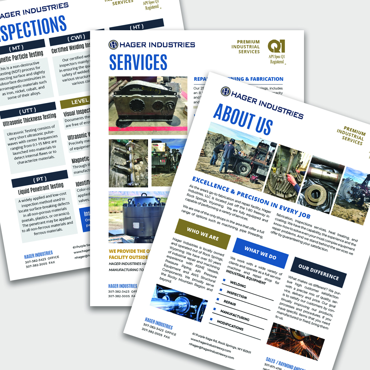
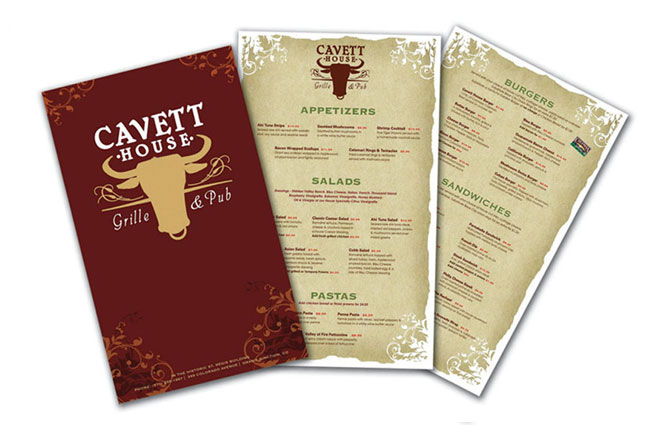
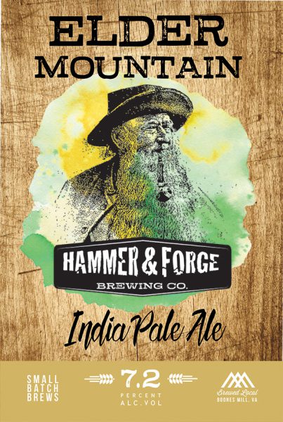
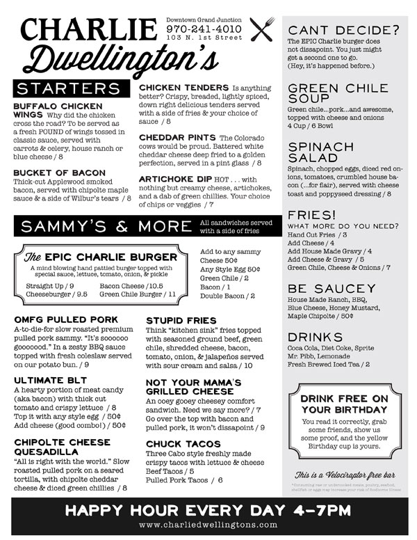
I organize information using hierarchy, typography, and layout so it’s easy to read, easy to understand, and easy to use whether it’s a menu, case study, brochure, or one-pager.
2. You need professional work, quickly.
I’m comfortable working this way.
I organize information using hierarchy, typography, and layout so it’s easy to read, easy to understand, and easy to use whether it’s a menu, case study, brochure, or one-pager.
3. Your brand feels incomplete or inconsistent.
I build systems, not just logos.
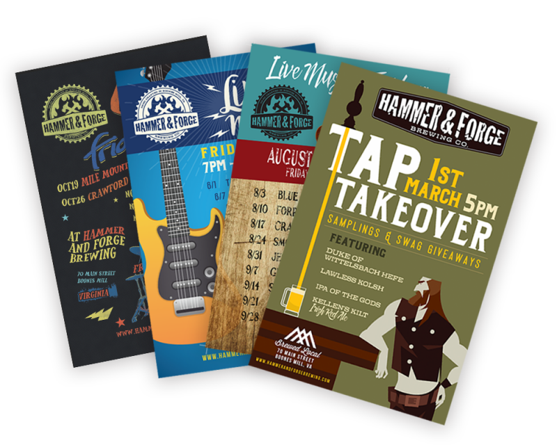
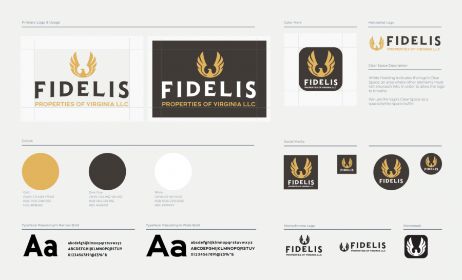
From brands created from scratch to refining what already exists, I design identity systems that scale across print, packaging, digital, signage, and marketing collateral, so everything looks like it belongs together.
The design works… but it doesn’t feel right yet.
The information is correct, but the design doesn’t inspire confidence or reflect the quality of your brand. I create work that feels intentional, polished, and trustworthy.
Case studies
Brand Identity + Menu Design + Social Media, Advertising + Marketing Collateral
BELLA GLOW
WELLNESS & AESTHETICS
SKILLS USED: Brand Development, Logo Variations, Social Media Design, Reusable Templates, Marketing Strategy, Copywriting, Print Design, Adobe Photoshop, Adobe Illustrator, Canva, Webdesign in Square
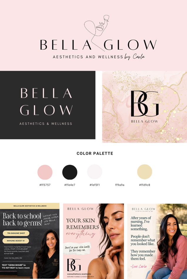
Bella Glow already had the beginning of a logo, but it needed to become a complete and consistent brand. I brought the pieces together, created the custom BG monogram and additional logo variations, and developed the color, typography, imagery, and visual direction used throughout the business.
I worked closely with the owner to turn a long list of medical aesthetics and wellness services into marketing that felt clear, personal, and easy to understand. The visual system needed to feel elevated and feminine while still building trust around medical services.
My ongoing work has included more than 50 original social media designs, reusable content templates, menu, marketing copy, promotional campaigns, service education, offers, Instagram organization, Linktree graphics, and English and Spanish messaging. I also developed local marketing strategy and designed print ready neighborhood postcards promoting medical weight loss, IV therapy, peptides, skin treatments, and other services.
The result is a flexible brand system that allows Bella Glow to market many different services while still looking recognizable, professional, and connected across social media and print.
Personal Brand Identity + Illustration + Pattern Design + Social Media + Marketing Collateral
LIZA HOCHEVAR
TITLE COMPANY / REAL ESTATE
SKILLS USED: Brand Strategy, Logo Design, Typography, Illustration, Pattern Design, Social Media Design, Marketing Collateral, Adobe Illustrator, Canva
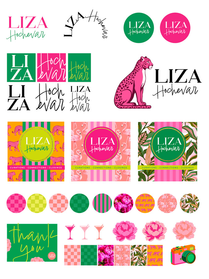
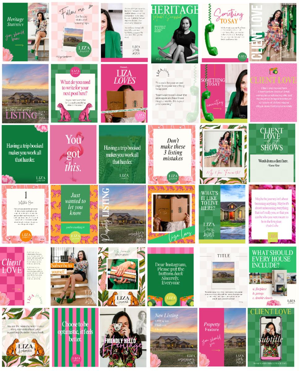
I created a complete personal brand for Liza Hochevar, a title industry professional who works closely with real estate agents in the Denver market. The goal was to build a recognizable identity around her personality, relationships, and colorful approach to business. Liza is a maximalist both in color and style so we went all the way.
Liza’s work is built around helping real estate agents strengthen their deals and professional networks. I developed the positioning “Connection is the New Luxury” and organized the brand around three ideas: curation, connections, and closings.
The identity combines bold color, fashion inspired typography, custom logos, playful illustrations, and original patterns. I created primary and secondary logos, submarks, a full color system, typography, business cards, social media templates, Instagram highlight covers, thank you cards, and Facebook graphics. The hand drawn leopard was created in Procreate.
The finished system gives Liza a personal brand that feels confident, memorable, and completely different from the traditional look of the title and real estate industry.
Brand Naming, Identity + Website
OAK & STONE LANDSCAPING
HOUSTON LANDSCAPING COMPANY
Skills Used: Brand Strategy, Business Naming, Logo Design, Typography, Web Design, Business Card Design, Brand Style Guide, Adobe Illustrator
The Project
Oak & Stone Landscapes is a family owned Houston landscaping company that has been serving the community since 2007. The business needed a complete brand upgrade, including a new name, logo, slogan, business cards, brand guidelines, and website.
The goal was to create a more professional and competitive identity that reflected the company’s experience, reliability, and quality of work.
The Idea & Process
The new name needed to communicate strength while remaining connected to nature. Because leaf symbols are so common throughout the landscaping industry, the client wanted an identity that would feel more established and distinctive.
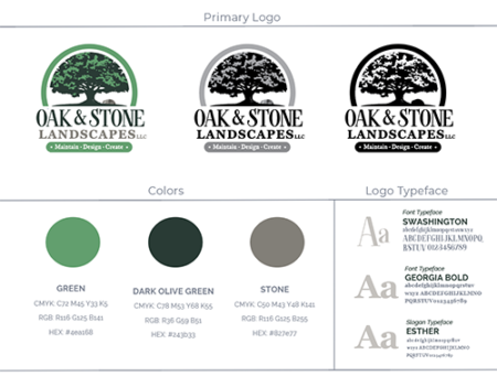
I developed the name Oak & Stone Landscapes around two materials that are strong, enduring, and deeply connected to the natural environment. Oak trees are familiar throughout Houston and symbolize wisdom, longevity, and growth. Stone adds a sense of permanence, craftsmanship, and higher end quality. Together, the name communicates landscaping designed to work hard and last.
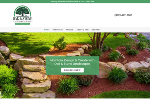
I created the logo, color palette, typography, slogan, brand style guide, business cards, and website. The finished identity gives this established company a more polished and memorable presence while honoring the strength, experience, and craftsmanship behind its work.
LOGO REFRESH + Website + Order Form design
BAKER’S BARN
BAKERY SHOP
Skills Used: Brand Strategy, Business Naming, Logo Design, Typography, Web Design, Business Card Design, Brand Style Guide, Adobe Illustrator
The Project
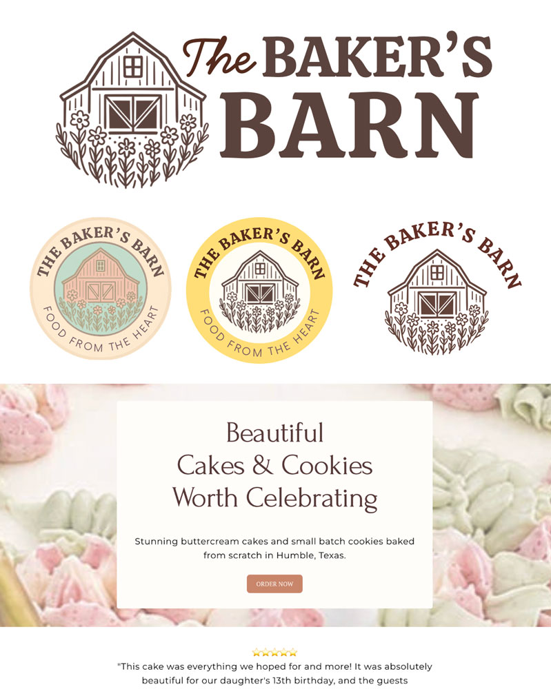
The Baker’s Barn is a Humble based cake and cookie business created by a former caterer who wanted to return to the work she loved. After COVID slowed her catering business, she finally had time to begin baking again but was unsure how to reposition the business, organize her offerings, or start accepting custom orders.
We worked together to define the business, strengthen the existing brand, develop the messaging, and create a website that could turn her renewed passion into a functioning business.
The Idea & Process
The original logo used several very light pastel colors that blended together and lacked contrast. Because the client still loved the barn and floral artwork, I completed a light logo refresh rather than replacing the identity entirely. I strengthened the typography, introduced deeper brown and terracotta tones, and created a softer supporting palette of cream, blush, and sage.
I developed the brand promise “Food from the Heart” and wrote the website copy around beautiful buttercream cakes and small batch cookies made from scratch in Humble, Texas.
I then designed and built the Square website, organized the cake and cookie menu, wrote the ordering instructions and FAQ, and created custom order forms to collect event details, serving needs, flavors, and design preferences.
The finished brand and website gave The Baker’s Barn a clear direction, a more polished and recognizable identity, and a simple way for customers to explore the menu and place custom orders.
Logo Refresh + Exterior Signage + Business Card Design
TEXAS HOME OUTLET
MODULAR HOME COMPANY
SKILLS USED: Logo Redesign, Signage Design, Business Card Design, Print Design, Adobe Illustrator
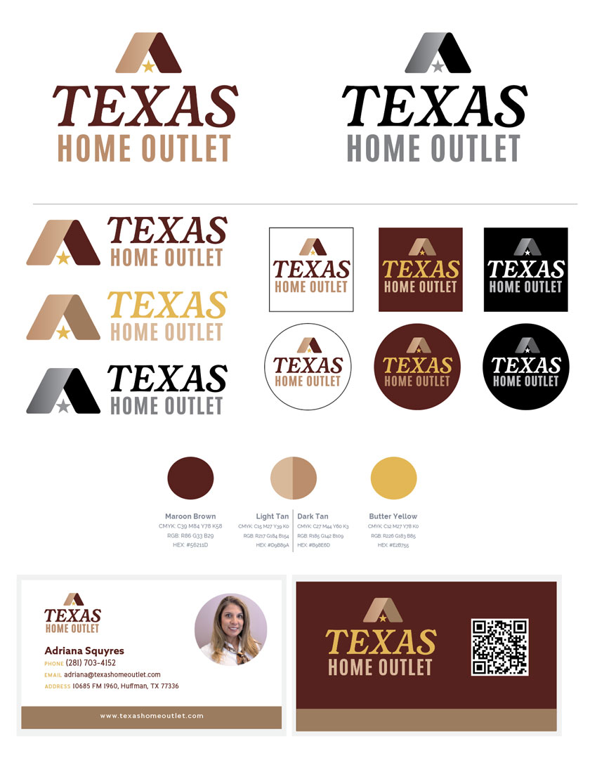
Texas Home Outlet is a Huffman based retailer offering manufactured and modular homes to Texas home buyers. The company had an outdated logo and outdoor sign but wanted to retain its recognizable color palette and established local identity.
The goal was to create a new logo and redesign the outdoor signage, giving the business a more modern and professional presence without losing the familiarity customers already knew.
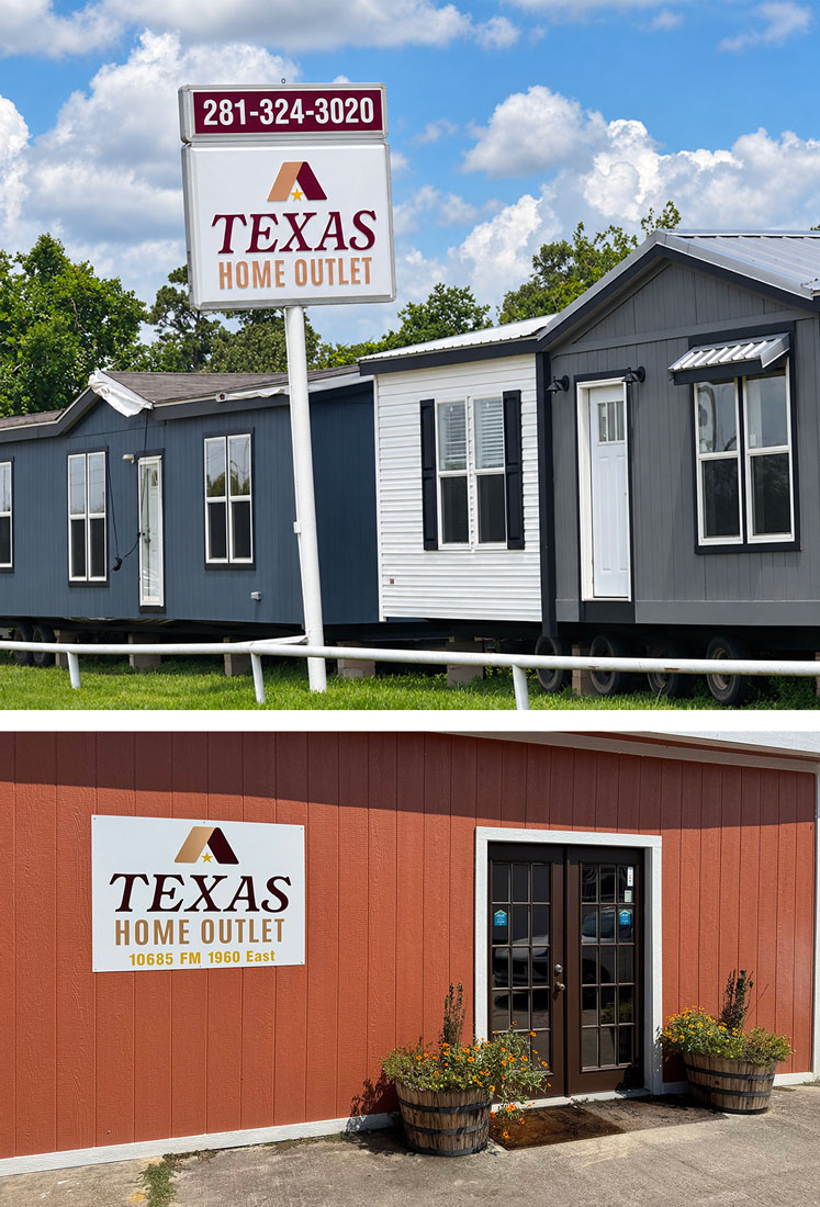
I redesigned the logo using cleaner typography and a more polished visual structure while working within the company’s existing colors. The updated logo was then adapted into a new outdoor sign designed to be clear, recognizable, and easy to read from the road.
I extended the refreshed identity to coordinating business cards, creating a consistent look across the company’s physical location and customer materials.
The finished identity gives Texas Home Outlet a stronger and more credible presence while preserving the familiarity of the original brand.
PORTFOLIO